Introduction In search of the One True Layout
Pure CSS-based layouts have come a long way but they still have shortcomings [note] that fail to address certain design goals without compromising the true separation of content and presentation.
In short, the problematic design goals are these:
Total Layout Flexibility
That is, the ability to order columns logically in the source while displaying them in any order desired. For any number of columns.
Equal Height Columns
Or more accurately, equal height columns without having to rely on faux columns.
Vertical placement of elements across grids/columns
Designers face the choice of relying on elements being a particular height, resorting to tables or simply not bothering.
Towards a solution
This article shows how to achieve each of these goals, and then how to combine them, creating what could be called the One True Layout™ [note].
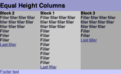
Problems with the Equal Height Columns method
Several problems have been found with the Equal Heights method, detailed in Appendix J.
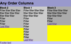
Any Order Columns
What?
A method for keeping columns (or more precisely, blocks of elements [note]) logically ordered in the source while still providing the designer the ability to display them in any order whatsoever without the need for any additional non-semantic markup.
Why?
It's good for the users
Browsers that do not make use of the CSS positioning information will present the content in the order that it is marked up. Consequently the ordering of content in the source code is important as far as accessibilty [note] and assistive technologies are concerned. [note]
It's good for you
The overriding rationale behind CSS is the separation of content and style - the removal of non-semantic cruft and complete ordering flexibility theoretically allows for repurposing of content without the need for tweaking html.
Although this might be less useful for an individual's site where markup can be altered to accomodate design changes, this is a huge win for systems based on templates where changing the html is either impossible or undesirable.
Furthermore it promises even greater customisability of a site for individual users. For instance, side columns could be swapped over or even placed on the same side (though whether this would be a good idea or not is debatable).
It's good for you and the users
Search engine spiders/robots read web pages like this - they start at the top left, read across, and then move down. Consequently the ordering of content on a page is important as far as search engine algorithms are concerned. [note]
How?
Through the magic of floats and (when necessary) negative margins. Each block is floated in the following way:
- Work out the desired leftmost point of the current block - Current Left
- Work out the rightmost point of any of the floated blocks that precede the current block in the source - Preceding Right
- Subtract Preceding Right from Current Left to give the current block's
margin-left- Current Margin
If we want the column blocks of our layout to be the same width and ordered 2-1-3, the maths work out like this:
| Current Left | Preceding Right | Current Margin | |
|---|---|---|---|
| Block 1 | 33% | N/A | 33 - 0 = 33% |
| Block 2 | 0% | 67% (Block 1) | 0 - 67 = -67% |
| Block 3 | 67% | 67% (Block 1) | 67 - 67 = 0% |
So given this HTML markup...
<div id="block_1">
	...
</div>
<div id="block_2">
	...
</div>
<div id="block_3">
	...
</div>
... we apply the following CSS:
#block_1
	{
	float: left;
	width: 34%;
	margin-left: 33%;
	}
#block_2
	{
	float: left;
	width: 33%;
	margin-left: -67%;
	}
#block_3
	{
	float: left;
	width: 33%;
	}
Units can be percentages if the layout is liquid, ems or pixels if fixed width. [note] [note]
Is it really that simple?
Of course not. It never is, is it? This method runs head first into a peculiarity in the layout engine of IE Win (5 and 6) - if block 1 is not the first column, it requires its margin-left to be divided by 2.
Investigating further, we find that the bug is triggered for any block n (where n is the position of the block within the source code) if:
- column positions 1 to n-1 are occupied by blocks 1 to n-1 (in any order)
- block n occupies column position 2n or greater
Under such circumstances element n will require its margin-left to be reduced - the overall number of columns appears to be irrelevant.
Keen readers will have noticed and been chomping at the bit to point out that this is the dreaded IE Doubled Float-Margin Bug. Well spotted. The good news is that the usual fix works just fine.
All that is required is display: inline targeted at IE for the element in question. It's only the first such block in the source ordering that needs this "hand holding" and once the fix is in, it magically sorts out any following elements which would otherwise need the fix.
So in the code example, block 1 is to appear as column 2 and triggers the bug, since its column position is equal to 2 times its source position [note]. Consequently we need to add the following CSS:
* html #block_1
	{
	display: inline;
	}
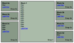
Example of the basic Any Order technique (2-1-3 ordering) [note]
So it's very nearly that simple. Or rather it is that simple. It's actually possible to simply set all the column elements to display: inline (as far as IE is concerned) without any unfortunate side effects and without any need to work out whether any of the column blocks need the hand-holding or not. [note]
Wrapping things up
As things stand in the example, there's no wrapper/container element holding the columns together. More often than not, you're going to want or probably even need one. Most likely, if you want to apply a faux-columns style background to the columns (or utilise the techniques developed later in this article), there's the not-so trivial matter of making sure that the container expands to fully contain the columns. And so the simple method sketched out so far becomes a little messier again.
Over the years, several non-cruft-introducing methods have been invented to deal with this. Unfortunately though, the overflow: hidden method causes everything to just blow up. And a bug in Firefox/Mozilla means that you can't use the simple floated container method, if, but only if, the longest column has actually been negatively shifted. That's a pretty big if, though. Using display:table works fine for a pure any order solution, but I've not used it here because it runs into trouble later on.
Fortunately, the original (and still the best ;) EasyClearingTM works just fine, if somewhat more verbosely than the alternatives.
Example of the Any Order technique with containing element (2-1-3 ordering)
The method even holds up if you want to use direction: rtl. In that case you just switch right for left in the column float and margin declarations.
Example of the Any Order technique as a right-to-left layout
Danger, er, Alex Robinson!
This method is, being a float-based method, prone to the usual float method problems. Because IE (both Win and Mac) violates the specs and expands elements to be at least the width of the largest nested element, things can get funky. This means that unexpectedly wide images or long unbroken strings of text will cause havoc with the layout.
NB. these problems are intrinsic to any float techniques in IE, and are not caused by the use of negativity itself, but because elements are being negatively shifted, an unexpected float wrap could cause some of those elements to be placed beyond the left edge of the viewport. Consequently, particular care should be taken with the following issues:
- italics
- the expanding box problem
- rounding errors when using ems or percentages
- quirky percentages in IE6's visual formatting mode
Other likely IE problems can be found at Position Is Everything's Explorer exposed! and Windows Explorer vs. the Standards. See also On having layout, the extremely thorough dissection of IE's layout engine quirks.
Where?
Works fully in
IE Win 7 beta 2, IE Win 6, IE Win 5.5, IE Win 5.01, IE Mac 5, Operas 7, 8 and 9, Firefox 1.5 [note] and 1.0, Netscape 8, Safari 1.03 (and up), OmniWeb 5
Doesn't work fully in
Netscapes 6 and 7
If the longest block has been negatively shifted under any circumstances (either directly or indirectly, so that it displays before any block that precedes it in the source order), its height is ignored. Instead Netscape treats as longest the longest block that has not been negatively shifted. This can cause any following elements to not be cleared correctly. Apart from that massive stumbling block, it works just great.
Other Browsers
This technique does not work in Opera 6 or Netscape 4. As is. That's right, it's possible to even make it work in those browsers if you really want to. That's so insane though, that I'm putting the details of how in this appendix.
Opera 5 is another matter - the blocks never become columns, stretching to fill the width of the container and stacking up on top of each other just as if they were regular unfloated blocks. Except that the column background colours don't show up. Well, if you must support Opera 5...
IE 4? I've got no idea. I can't get it to run on any of the Windows machines I've got access to. I don't imagine that it will behave very well though. Or in IEs 2 or 3. Or Netscape 2 or 3.
When?
The method is both robust and generic. It allows for proper logical source ordering with the flexibility to layout in pretty much any manner. [note]
Alternative methods
However, it is certainly true that the columns can shift a pixel or two when percentages are used. If you can guarantee the longest column, the Ordered Absolute method gives more precision for percent-specified layouts.
And if you can bear a bit of javascript, Absolutely Positive, Shaun Inman's routine for "clearing" absolutely positioned elements, offers a potentially much more powerful method for achieving all this and more.
Tom Wright's CSS Negative Margins Algebra is another CSS-plus-negatively- margined-float approach that's more than worth a look. While perhaps not being as generic as this method, it does allow you to completely remove any interdependence between the positional CSS and the underlying semantics.
Existing methods
The original Source Ordered Columns [note] goes a long way towards satisfying the same issues that the Any Order technique does, but it requires a semantically unnecessary inner wrapping tag to group some of the columns together. This reliance on an inner wrapping tag also limits the number of possible column orderings. Removing the need for the inner wrapper allows all possible orderings to be achieved (though the inner wrapper can serve other purposes. See Appendix H for the theory of possible orderings.
Related methods
It would be criminal not to mention Ryan Brill's Creating Liquid Layouts with Negative Margins, Thierry Koblentz's neat riff on Ryan's original 3 columns fluid layout, Doug Livingstone's CSS Columns and Position is Everything's Piefecta
All these methods provide a way for mixing pixel widths in liquid layouts. A variation on the basic Any Order technique which can achieve the same results can be found here.
Newer methods
Because the web never sleeps...
Eric Meyer had a brainwave in the middle of a workshop and came up with Multi-Unit Any-Order Columns which does exactly what it says on the tin.
Matthew Levine went questing for a better way to mix pixel widths into liquid layouts in In Search of the Holy Grail.
Liberté, Egalité...
Now that we have the freedom to put our columns in any old order, let's move on to that perennial CSS favourite, how to make them the same height.
Equal Height Columns - revisited
Stop Press!
Several problems have been found with this technique since publication. Those problems are discussed in Appendix J
Huh?
As an astute disciple of CSS, you are probably about to point out that there is a well-known tried and tested method for this (and as already mentioned earlier in this article), the one popularised in Dan Cederholm's Faux Columns. If so, just wait - we are returning to the scene of the crime...
Who?
The real credit for this technique belongs to Mark Challoner who had the crucial insight - I have merely helped polish it to the point where you can see your boots in it.
What?
What it says on the tin - a method to make all columns appear to be the same height. But without the need for faux column style background images.
Why?
Because equal height columns are a perfectly reasonable design goal. And the even more astute disciple will be nodding sagely, ruminating over the problems that flow from faux columns. Namely:
- you have to change your background images any time you adjust the widths of your columns
- you have to do some weird and brain-hurting calculations if your design is not a fixed-width pixel-based layout
- you have to create background images in the first place, even if all you want to do is apply a solid background colour (or heaven forbid, a simple gutter line)
- you have to add an additional wrapping container div for each additional faux column you want
- some layouts are quite simply impossible to achieve [note]
The most astute disciple is already one step ahead and is awaiting the pronouncement that Faux Columns are dead. I wouldn't go that far - in fact, they probably remain the weapon of choice. However, the method about to be described certainly provides an alternative that overcomes the problems above in some, if not all, circumstances.
How?
The basic method works like this:
- Blocks which will act as columns must be wrapped in a container element
- Apply
overflow: hiddento the container element - Apply
padding-bottom: $big_value[note] to the column blocks, where $big_value is a large enough value to guarantee that it's equal to or larger than the tallest column - Apply
margin-bottom: -$big_valueto the column blocks
What happens is that columns really become as tall as the content they contain plus $big_value thanks to the padding-bottom. The negative margin-bottom brings the flow of the document back to where the same point as where the padding-bottom began, and the overflow: hidden on the containing element chops off the overflow[note]. Consequently the columns' presence on the page only appears to be the height of the containing element and any background colour (or image for that matter) applied to the columns displays for that height. Most crucially, the height of the page reflects what appears to be on the page and does not dissappear into the scrolling distance.
Remarkably, IE Win doesn't actually need the overflow: hidden, but it causes no problems so there is no need to hide it.
Beware though, browsers don't let you throw arbitrarily large values at them. They have limits. Exceed that limit and the columns will expand to the padding-bottom value and you'll end up with some pretty long pages. Fortunately, we know the number of that limit (which is actually provided by Safari which is the most conservative browser in this matter): 32767px. This should suffice for most cases (though feel free to use a smaller value) and yields us code like this:
#block_1, #block_2, #block_3
	{
	padding-bottom: 32767px;
	margin-bottom: -32767px;
	}
#wrapper
	{
	overflow: hidden;
	}
Now if you wanted to actually achieve a 0.5em padding-bottom on the column, then you'd need code like this: [note]
#block_1, #block_2, #block_3
	{
	padding-bottom: 32767px;
	margin-bottom: -32767px;
	padding-bottom: 1000em;
	margin-bottom: -999.5em;
	}
There seems to be a consensus that pixel values are usually a better bet for this type of malarkey. So, unless you need to do something like the previous example, it's wisest to stick to pixel values - especially since an em-based value which might seem fine at one font setting can end up breaking the browser's actual limit when increased.
The rough edges
Of course, it's only to be expected that things aren't quite that simple, and that we'll need to polish things up before this is production-ready.
Safari
I'm not sure exactly which versions of Safari this effects, but the padding-bottom has a ghost effect that, though the columns are painted correctly, links and form elements that follow the columns and that by rights should be above it, are unclickable. (Fixed as of 4 November 2005)
This problem can be overcome by setting position: relative on any of the necessary elements. However, An unintended side-effect is that it cause such elements to vanish in IE Wins, 5.01 and 5.5, so we need to prevent those browsers seeing the position: relative.
For example, if we had an element with the id "affected_element", we would add the following: [note]
* > #affected_element
	{
	position: relative;
	z-: 1000;
	}
IE Mac 5
IE5 Mac gets the column heights right, but the height of the page ends up including the invisble padding. Whether or not you think this is acceptable is up to you, but a simple backslashed comment hack will prevent IE5 Mac from doing the whole equal heights expansion. Graceful degradation, baby...
/* Start Mac IE5 filter \*/
#block_1, #block_2, #block_3
	{
	padding-bottom: 32767px;
	margin-bottom: -32767px;
	}
/* End Mac IE5 filter */
Opera - take 1
Operas 7.0 through 7.2 don't actually chop off the extended columns at the right place. For sure they don't march off quite as far as the numbers would make you think they would, but that's little comfort when you've got huge columns obliterating all in their path.
Adding display: inline-block to the container element would solve this, but it would cause other problems to pop out from under the Opera bug carpet which are possibly fixable, but life's just too short - the most robust solution is to add our old friend EasyClearing, and all's well again.
Apart from in IE Win 5.01, where the addition of the easy clearing causes the exact opposite to happen - ie. where before all was well, now the columns stretch off into the distance. Because of Opera, mind. Fortunately, we can just add a float: left; and 5.01 is happy again.
* html #wrapper
	{
	float: left;
	}
Example of the Equal Height Column technique (2-1-3 ordering)
Opera - take 2
Opera 8 introduced a bit of a bug to its handling of overflow: hidden. So, even though the easy clearing is enough to sort out the lesser Operas (though note that 7.54 works just fine without any "help"), we are again faced with columns that wouldn't look out of place in The Towering Inferno.
Fortunately, once more there is a fix. The large padding-bottom/negative margin-bottom routine needs to removed from the columns themselves and applied to elements within them instead.
The most obvious way to achieve this would be to set a class on the final element in each of the columns, but that would be bad since a) you need to add the class in, and b) the class is essentially playing the same role as a clearing break element - since the class is actually a structural aid rather than saying anything about what's actually within the element in question.
Better is to use the :after pseudo element which we can rely on since we're targeting a modern browser. Rather than using padding-bottom, we use padding-top instead, since we can't rely on visibility: hidden to hide the generated content. Because otherwise the generated content doesn't actually increase the height of the column, somewhat defeating its purpose.
Of course, removing the padding-bottom from the columns causes all the other browsers to collapse the columns. We could hide the removal from IE Wins with a child descendant hack, but that wouldn't help Safari and Firefox. So we reach into our box of tricks and pull out the @media query hack [note].
Here's what the addional Opera 8 code looks like:
/* Start Mac IE5 filter \*/
#block_1, #block_2, #block_3
	{
	padding-bottom: 32767px;
	margin-bottom: -32767px;
	}
/* End Mac IE5 filter */
@media all and (min-width: 0px) {
#block_1, #block_2, #block_3
	{
	padding-bottom: 0;
	margin-bottom: 0;
	}
#block_1:after, #block_2:after, #block_3:after
	{
	content: '[DO NOT LEAVE IT IS NOT REAL]';
	display: block;
	background: inherit;
	padding-top: 32767px;
	margin-bottom: -32767px;
	height: 0;
	}
}
Example of the Equal Height Column technique with a fix for Opera 8 (2-1-3 ordering)
Opera - take 3
The good news is that the beta version of Opera 9 fixes the bug in Opera 8. Considering the relatively small proportion of Opera users and the likelihood of such users to upgrade often and early, it's probably OK to just leave out the Opera 8 fix.
On the other hand, if you want to figure out how to distinguish Operas 8 and 9, I'm not going to stop you.
Where?
Stop Press!
Just in case you missed the bit at the top of the page, several problems have been found with this technique since publication. Those problems are discussed in Appendix J
Works fully in
IE Win 7 beta 2, IE Win 6, IE Win 5.5, IE Win 5.01, Operas 7, 8 and 9, Firefox 1.5 and 1.0 [note], Netscape 8, Safari 1.03 (and up), (OmniWeb5.0?)
Doesn't work fully in
Netscapes 6 and 7
The longest column must not have been negatively shifted under any circumstances otherwise we're in the same old boat of following elements not being cleared correctly as with the Any Order Columns method. But with an added twist. Since the containing element has been set to overflow: hidden, anything in the columns below the point that Netscape mistakenly believes is the endpoint of the columns is cut off and not displayed.
IE Mac 5
As mentioned previously, the method causes the page to expand to the "actual" height of the columns. The choice is yours whether to accept that or to forego the equal heights in this superannuated browser, currently tottering around the edges interweb waiting to be put out of its misery.
Operas 5 and 6
Do not understand the method at all. It is left as an exercise to the reader to figure out the necessary hacks to cope with those browsers if required.
When?
This method is fairly robust, generic and nestable.
It can get a little gnarly under certain circumstances - in Operas and IE Win 5.01 (see the expanded examples for details.)
Alternative methods
Faux Columns have already been discussed. Ingo Chao has a faux columnless two em-based columns with equal height.
Modern browsers hold out the promise of being able to use display:table to achieve much the same effect. However once you have chosen that route you are stuck with a rigid table structure. There is no way you can reorder the column blocks. Moreover, browser support for positioning elements relatively or absolutely within a table cell, whether the cell actually a td, th or another element with display:table-cell) is non-existent except for some slight support in iCab 3.0. Apparently. Which puts you back to square one having to write markup that looks like a traditional table.
Breaking the gridlock
Now that we have our revised mechanism for making columns the same height, it's time to turn our attention to how to position elements vertically within those columns.
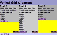
Vertical Grids
What?
A method enabling the vertical positioning of elements across grids/columns
Why?
Because it's a perfectly reasonable demand that designers should be able to control the vertical as well as the horizontal axis.
Some may argue that designers shouldn't even have control over the horizontal axis, but if you agree with that position what the hell are you doing reading this article?
Still reading?
Get your tables on
The age old method for dealing with vertical positioning is to use tables. Stick what needs to be top aligned in cells in one row; what needs to be bottom-aligned goes in the row that follows.
The good thing about the table-based way is that it works.
The bad things about the table-based way is that it forces the designer to separate logically connected elements into an arbitrary source order dictated by the design alone. Which is bad from the semantic point of view but even worse from the practical one, since it leads inexorably to the creation of gnarly, nested, hard-to-maintain tag soup.
It also means that bottom-aligned elements must appear below all the elements within the top-aligned block and not level with the last element within it as might be desired. Or middle-aligned.
However, it does work and does so reliably which counts for a lot when it comes to web development. It doesn't stop it being utterly dirty though.
I know how tall you are
No, not you. The elements within which I want to vertically align things.
This is the other more modern approach - as long as you know the height of the column elements then you can just set position: relative on the column element and then any elements within it just need position: absolute.
To know the height, you have to know that your content will be that height (eg. the only content in the "flow" will be images which are the same height across the columns - over which you then position your text and any other images) or that your content will not make the element be higher than that and set the height attribute.
Which is fine so far as it goes, but as soon as you need any kind of vertical liquidity, then this approach breaks down. Which is why so many designers simply don't bother.
How?
The problem with the modern approach is that it's not possible to guarantee the height of the individual column blocks.
However, we can rely on the height of the containing element by applying any of your favourite float clearing methods to ensure that the container element does indeed contain the columns. After that, it's just a matter of applying position: relative to the container element.
Now if we apply position: absolute to any element within the column blocks, it will be vertically positioned relative to the container element.
Which gives us the ability to snap things to the bottom or middle of the grid across all the columns.
Of course, it also means that the element will be positioned relative to the container tag horizontally as well.
This isn't a problem though if all we want to do is shift the element vertically. As long as we only set the element to appear at, say, bottom: 0 or top: 50%, then it will appear horizontally aligned with the column it's in. If we want to shift the element from the left edge of the column, all that's needed is a suitable amount of margin-left.
The power of the right
But what if we do want to offset the element from the column's right edge (which truth be told, is the most likely use for this)?
The simplest, if not the easiest, solution is to set individual right values, where those values are equal to 100% - the value of the rightmost point of the column. [note]
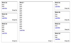
Example of the Vertical Grid technique (simple version with 2-1-3 ordering)
A Night at the Phantom of the Opera
If you just looked at the previous example in Opera (7 or 8, forget about 6), you might have noticed that things are a little off.
First off, it fails to get the vertical positioning right at all if percentages are used. That's why the "L" Snaps are at the very top of the containing tag and don't start in the middle as they should.
Adding float: left and an explicit width: 100% almost solves things, but not well enough. Block 1's snap still floats to the top and none of the elements picks up on the height: 50%. It looks like Opera is a hopeless case, and the best that can be achieved if Opera must be catered for is aligning to the absolute top or bottom using pixels or ems.
Opera Crackers
Secondly, the horizontal shifting works sometimes. That is sometimes it doesn't, failing to apply background colours and shifting the element less than it actually requires. I can't figure out the cause of this monkey business at all (it doesn't appear to be the negative margins since it fails even more spectacularly when ordered 1-2-3) which means that there is no simple CSS fix. (And this is the case whether the layout is percentage-, em- or pixel-based.)
Which means...
Duck Tag Soup
We need a markup fix. If we wrap the element we want positioned on the right, that element can be made to be the width of the column and then absolutely positioned on the right within it.
As if it's not bad enough that it's a markup fix (though since it's just an additonal wrapping tag, it's low down the scale of markup atrocities), we now run into the different models that browsers use to calculate the width of nested absolutely-positioned elements. To be blunt, Opera and IE Win make it easy, but get it wrong (according to the standards, that is, but that's the only game in town).
So for Opera and IE Win all we need to do is:
.verticalalign
	{
	position: absolute;
	bottom: 0;
	width: 100%;
	}
.verticalalign p
	{
	position: absolute:
	right: 0;
	bottom: 0;
	}
NB. floating the inner element would probably do just as well in most situations
But because, Safari and Mozilla get it right, that would make the element-to-be-aligned 100% of the wrapping element. The correct value for the width in those browsers is the actual width of their parent elements. So now we add:
.verticalalign
	{
	position: absolute;
	bottom: 0;
	width: 100%;
	}
#element_1 .verticalalign
	{
	width: 34%;
	}
#element_2 .verticalalign
	{
	width: 33%;
	}
#element_3 .verticalalign
	{
	width: 33%;
	}
Of course, .verticalalign is now too narrow in Opera and IE! So we plump them back up again with a media query hack for Opera (subject to the same caveats as before), and a star html hack for IE. Hey presto!
/* hack for Opera 7+ */
@media all and (min-width: 0px){
.verticalalign
	{
	width: 100% !important;
	}
}
/* hack for IEs of all persuasions before IE7 */
* html .verticalalign
	{
	width: 100% !important;
	}
Opera - let's start all over again
As of the beta version of Opera 9, the position and dimensions of absolutely positioned and fixed position elements are treated correctly when they are nested inside each other (except for that vertical percentage thing mentioned above). So now the width: 100% gets applied as it should. Which screws things up big time.
As I said on the previous page, there is such a relatively small number of Opera users (who in all likelihood upgrade often and early), that it's probably OK to just leave out the Opera 8 fix.
Mind you, if you do want to figure out how to distinguish Opera 9 from previous versions, I'm really not going to stop you. Well, actually I am. You see, I've already got one. CSS3 attribute selectors to the rescue!
/* hack for Opera 7+ */
@media all and (min-width: 0px){
.verticalalign
        {
        width: 100% !important;
        }
/* But Opera 9 does it right, so CSS3 hax to the max */
div[id^="wrapper"] #block_1 .verticalalign
        {
        width: 34% !important;
        }
div[id^="wrapper"] #block_2 .verticalalign
        {
        width: 33% !important;
        }
div[id^="wrapper"] #block_3 .verticalalign
        {
        width: 33% !important;
        }
}
Example of the Vertical Grid technique (2-1-3 ordering)
Where?
Works fully in
IE Win 7 beta 2, IE Win 6, IE Win 5.5, IE Win 5.01, Operas 7, 8 and 9, Firefox 1.5 and 1.0, Netscape 7 and 8, Safari 1.03 (and up)
Doesn't work fully in
IE Mac 5
Pretty much works - but absolute positioning is flaky at the best of times in this tired old workhorse
Netscape 6, Operas 5 and 6
Do not understand the method at all. It is left as an exercise to the reader to figure out the necessary hacks to cope with those browsers if required.
When?
It's a bit finickity, but the technique is pretty sturdy unless you must support older browsers.
You could instead reach for display:table but that results in, frankly, equivalent but less readable code than tables. And you can't then position elements absolutely within the table cells[note]. And even if the positioning was possible, you'd be stuck with the intial source ordering of the columns...
Of course, it should all be so much easier than this, as Eric Meyer laments in CSS Gridlock.
Quest's End
The individual pieces are in place - time to bring the holy bacon home.
Putting it all together
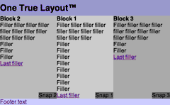
Back in the introduction, I made a rash claim - that I could conjure up a layout that satisfied:
- total layout flexibility
- equal height columns
- vertical placement of elements across grids
Now comes the magic moment. We've seen how to solve each of these problems in isolation. What happens if we just stick them all together?
Well, to cut to the chase, it works in all the browsers that the individual techniques work in. Except... and it almost makes me weep to say it. Except Firefox 1.0.
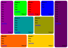
Example of the One True Layout™ (2-1-3 ordering)
Firefighting Firefox
This time we've run into a delightful bug. If an element has position:relative and overflow:hidden but no explicit height, then nested elements positioned absolutely within it vanish completely in Firefox 1.0. And until this is fixed, there is no CSS workaround for it.
Stop Press!
This bug has been fixed in Firefox 1.5. Indeed, it was fixed in the Gecko engine as of version 1.8b2.
It's time for another markup fix. We can't dispense with either the position:relative or overflow:hidden, but we can remove the overflow from #wrapper and apply it to another element that we put around it:
<div id="wrapper_extra">
<div id="wrapper">
<div id="element_1">
	...
<div class="verticalalign"><p>Snap 1</p></div>

</div>
<div id="element_2">
	...
<div class="verticalalign"><p>Snap 2</p></div>
</div>
<div id="element_3">
	...

<div class="verticalalign"><p>Snap 3</p></div>
</div>
</div>
</div>
#wrapper_extra
	{
	position: relative;
	}
#wrapper
	{
	overflow: hidden;
	position: relative;
	}
This placates the mysterious Firefox bug, but causes IE to lose the plot. No matter, that's easy to fix:
* html #wrapper
	{
	position: relative;
	}
Example of the One True Layout™ with a fix for Firefox (2-1-3 ordering)
Where?
As previously noted, it works everywhere the individual techniques do. See Appendix B for all the gory details.
Show me the money shot
Would sir care to peruse some more involved examples?
Examples
You'd probably feel cheated if I didn't roll out some more examples that give an idea of how these techniques could be put into action. So without further ado: [note]
Interactive demo
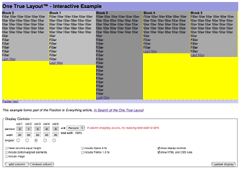
Add columns! Switch the order around! Turn methods on or off! Toggle units! Support idiot browsers!
You call the shots.
Nested rounded corners example
A pixel-based fixed width layout that shows just how crazy you can go repeatedly nesting the combined technique within itself.
Not only is this a layout that would be impossible to achieve with a table-based layout [note], but the source ordering is a joy compared to how you'd have to do it [note]
Of course, this version is somewhat overladen with hacks and additional markup. So, just to show how it could (nay, should and will) be, here's a slimmed down version that jettisons all the extraneous cruft. Of course, it only works in Safari... (and Firefox as of 1.5)
Boxes example
A scalable em-based layout which is unremarkable other than the fact that it raises yet more questions about Opera's positional abilities, and that it would be nigh on impossible to achieve with Faux Columns.
Borders with backgrounds example
A liquid percentage-based layout that is utterly unremarkable. Even Opera 8 doesn't require any particularly bizarre hacks.
Results for these examples can be found in Appendix C.
"Real world" examples
Unfortunately legal and intranet issues prevent me from showing you genuine working sites using these methods. Consequently I've brewed up a couple of quick makeovers that achieve much the same results as the orignals but using the now, all-too familar techniques.
Tucows design fragment example

A retrofit of an existing design pattern achieved without touching the underlying HTML.
BBC home page 'makeover' example

Reimagined from the ground up as a scalable em-based layout without a table in sight.
And finally...
Yes, finally.
Conclusion
The Any Order and Vertical Grid techniques are fundamentally simple. More importantly, they will carry on working for as long as browsers support CSS2.1. All that will change is the dropping some of the hacks which are only needed to help the current crop of browsers (Safari notwithstanding - and Gecko once they get that regression bug fixed). That is, the techniques will improve over time. Why? Because these techniques do exactly what the specs say you can do.
On the other hand, the Equal Height technique is a kludge - despite the fact that the basic concept is solid and that any future browsers that are properly conforming will support it (Or maybe not...). But it's only needed because display: table-cell doesn't allow for a) reordering the columns, or in today's mainstream browsers at any rate, b) absolute or relative positioning.
Bits and bobs
There was a whole lot of stuff that didn't really fit in the article and has been shunted into appendices. Of these, the most interesting is probably the one on creating any order columns with liquid center and fixed-width sides. Seeing as people like that kind of thing for some reason.
One step forward, two steps backwards...
The techniques described in this article were almost completely worked out around Christmas 2004. Unfortunately by the time I got round to actually publish them, the beta of Opera 8 had been released. It's only recently that I was able to spend the time to figure out a fix for that.
And now the latest beta version of the Gecko engine is upon us and causing even more havoc. Well tough. This time I'm publishing. I refuse to be bowed once again by a browser's failing - especially where that failing is a reversal of previous correct CSS support.
and two more steps forwards...
Opera 9 was released in beta the day before this article was first published. It fixes all the bugs mentioned throughout this article. And then the Mozilla team fixed the bug that screwed up the Any Order method and incorporated the fix at double quick time on 2 November 2005. All's well that ends well.
Famous last words
All that's left to say, is "Rock on IE7"! [note]
... actually IE7 (as of beta 2) seems to pretty much work, though when zooming, things can go a bit awry if percentages have been used. The only tweaks needed seem to be those instances where * html has been used to hide the forcing of hasLayout on IE and where IE7 still needs it - eg. the plain vanilla vertical grids.
Appendix AAcknowledgements
When first working on the Any Order Columns method, I spent an entire evening barking up the wrong garden path trying to figure out a crack-fuelled formula that would cope with IE's margin shifting problems. However, as John Gallant pointed out to me, it was just the IE Doubled Float-Margin Bug. Without Big John pointing out what now seems hilariously obvious in hindsight, I would have abandoned the whole exercise since my hacked-up approximations would never have done for "real world" usage. He also, as always, provided much encouragement and useful advice.
As noted in the course of the article, the Equal Height Columns method was actually invented by Mark Challoner and posted to [css-d] in November 2004. Strangely that announcement passed by with barely a murmur. Possibly it was because there were still some issues with the technique (though usually that spurs [css-d] into action). Mark and I continued to bash away at the technique until it was polished into pretty much the form you see here. Indeed, it was Mark's crucial insight that led me to embark on this whole mad crusade.
Thanks also to Ingo Chao, Bob Easton, Zöe Gillenwater, Eric Meyer, Gunlaug Sørtun, Ryan Thrash and Philippe Wittenbergh for help and comments at various stages of this article's development.
Post-publication
Massive thanks to the Mozilla team for fixing the negatively-margined float bug in record time and getting the fix into Firefox 1.5.
Thanks also to: Andrey Petrov for reporting and suggesting fix for IE6 bug in basic demo; Donna Casey for reporting the crazy text scroll problem that Firefox 1.0 has with the Nested Rounded example and Ingo Chao for coming up with a simplified test case and fix for it; Andrew Soderberg for pointing out the printing problems in IE; Bill Wallace and Chris W Parker for suggesting moving #footer's clear:both into the core css and out of the ancillary css file; Rob Cochrane for spurring me on to add support for direction:rtl; Randy Syring, Rick Brenner and Peter Lewis for typo detection; Philippe Wittenbergh (of course) for creating copious test cases and pointing out the Opera 9 overflow:hidden behaviour change was for passing the Acid 2 test; Ingo Chao (that man again) for half slaying the anchor problems in Geckos; Mauricio Samy Silva for fixing the modern browsers problems with the hover on the link back to PIE's home page.
In chronological order, the following reported the problems with links to anchors with equal height columns: Leevi Graham, Bryan Buchs, Vitaly, Xavier Guilbert, Justin Watt, Micah Wylde, Thoreau Lovell, Trevor Creech, Neil Drumm, Sebastiaan van Achterbergh, Vince Bishop, joey3xRoadRunner, Michael Hickland, Jakub Wojtaszczyk, Eric Everman, Jennifer Hiller, Franck Bossy, Jörn Hofer, Keisuke Omi, Stefan Schlachter, Jesse Scott, Christopher M Kelly, Ischa Gast and Kevin White.
Appendix BBrowser results for the methods
For browsers which exist for different platforms, the results are the same unless expliclty mentioned.
| Browser | Any Order | Equal Heights | Vertical Grid | Combined |
|---|---|---|---|---|
| IE Win 7 beta 2 | pass | pass | fail (mild) [note] | pass |
| IE Win 6 | pass | pass | pass | pass |
| IE Win 5.5 | pass | pass | pass | pass |
| IE Win 5.01 | pass | pass | pass | pass |
| IE Mac 5.2 | pass | fail (mild) [note] | fail (mild) [note] | fail (mild) [note] |
| Firefox 1.5 | pass | pass | pass | pass |
| Firefox 1.0 | pass | pass | pass | pass [note] |
| Netscape 8.0 | pass | pass | pass | pass |
| Netscape 7.2, 7.1, 7.0 | pass [note] | pass | fail (mild) [note] | pass |
| Netscape 6.2, 6.1 | pass [note] | pass [note] | fail (severe) [note] | fail (severe) [note] |
| Netscape 6.0 | fail (total) [note] | untested | untested | untested |
| Netscape 4.7 | fail (fixable) [note] | untested | untested | untested |
| Opera 9.0 (beta) | Pass | Pass | Pass[note] | Pass |
| Opera 8.0, 8.5 | pass | pass | pass | pass |
| Opera 7.5 | pass | pass | pass | pass |
| Opera 7.2, 7.1, 7.0 | pass | fail (severe) [note] | pass | fail (severe) [note] |
| Opera 6 | fail (fixable) [note] | fail [note] | fail [note] | fail [note] |
| Opera 5 | fail (total) [note] | untested | untested | untested |
| Safari 2.0, 1.3, 1.2, 1.03 | pass | pass | pass | pass |
| OmniWeb 5.0.1 | pass | pass | pass | pass |
| iCab 3.02beta | pass | pass | pass | pass |
| iCab 3.01beta | pass | pass | fail (total) [note] | fail (total) [note] |
| IE Win 7 beta 2 | |
|---|---|
| Vertical Grid |
Example as it stands fails Solution is to force get |
| IE Mac 5.2 | |
| Equal Heights |
By not feeding IE Mac the padding- and margin-bottom values that are behind the equal height, we get an acceptable degradation - if IE Mac 5 really must be catered for, then it's nothing faux-columns suitably applied can't handle On the other hand, if IE Mac 5 does get to see the padding- and margin-bottom values, the failure is catascrophic as it makes the page that height |
| Vertical Grid |
Snaps placed above wrapper div (despite being able to paint wrapper's background to the correct height) Solution is to not give IE Mac 5 the absolutely positioning for snap and to just let it take its place in the flow |
| Combined |
Now the snaps vanish entirely The fix is the same as the solution for snapped elements without equal columns |
| Firefox 1.0 | |
| Combined |
A bug when #wrapper's However, by wrapping another div around #wrapper and moving It's annoying that this has to be done, but so far it's the only known fix |
| Netscape 7.2, 7.1, 7.0 | |
| Any Order |
See article body for details |
| Vertical Grid |
Snaps placed correctly to the bottom of the wrapper div, however 1em additional bottom margin sneaked into the wrapper div and so the snaps are 1em below the bottom of the longest column. But check the combined result... |
| Netscape 6.2, 6.1 | |
| Any Order |
Same caveat as for NS7 |
| Equal Heights |
Some elements beneath the wrapper appear not to be able to receive clicks - the footer is ok so there you go |
| Vertical Grid |
Snaps vanish ... and where they gos, nobody knows |
| Combined |
Netscape 6.1 Since the snaps fail, unsurprisingly the combination fails too - the equal height stuff still works just fine |
| Netscape 6.0 | |
| Any Order |
Columns simply stack up on top of each other |
| Netscape 4.7 | |
| Any Order |
See the appendix that deals with older browsers. |
| Opera 9.0 (beta) | |
| Vertical Grid |
To get Opera 9 and 8 to play together at the same time requires some mundane if verbally spectacular and verbose hackery. Of course, you could just drop support for Opera 8... |
| Opera 7.2, 7.1, 7.0 | |
| Equal Heights |
Percent works just fine. Pixels and ems go haywire and extend the columns. |
| Combined |
Percent also stops working in just the same manner as the equal height failure. |
| Opera 6 | |
| Any Order |
See the appendix that deals with older browsers. Additionally, the em version makes the columns too narrow for some reason |
| Equal Heights |
There's a rendering display problem (which is probably the cause for Mark's extra content wrapper div) when the page is left and returned to (clicking back and forward, switching to another app and back again, but not reloading the page), everything is magically ok! |
| Vertical Grid |
Horribly messy Each Snap extends from the bottom of its column to the bottom of the viewport (nice job on your positioning there Opera 6). |
| Combined |
The messiness of the snap placement, and the equal heights stop working. But because of the overflow:hidden, the extended snaps are also subject to the magic of the equal height's "now you see it, now you don't" page revisit born againness |
| Opera 5 | |
| Any Order |
Columns don't even begin to be treated as such - they just stack up vertically, ie. as usual |
| iCab 3.0 beta | |
| Vertical Grid |
The vertically positioned elements don't show up at all. Which is very odd since the examples work in iCab just fine. |
| Combined |
Still no sign of the vertically positioned elements. |
Appendix CBrowser results for the examples
For browsers which exist for different platforms, the results are the same unless expliclty mentioned.
| Browser | Nested Rounded Corners | Boxes | Borders |
|---|---|---|---|
| IE Win 7 beta2 | Pass | Pass | Pass | IE Win 6.0 | Pass | Pass | Pass [note] |
| IE Win 5.5 | Pass | Pass | Pass [note] |
| IE Win 5.01 | Fail (mild) [note] | Fail (moderate) [note] | Pass (?) [note] |
| IE Mac 5.2 | Fail [note] | Fail (mild) [note] | Fail (mild) [note] |
| Firefox 1.5 | Pass [note] | Pass | Pass |
| Firefox 1.0 | Pass [note] | Pass [note] | Pass |
| Netscape 8.0 | Pass | Pass | Pass |
| Netscape 7.2, 7.1 | Pass [note] | Pass | Pass |
| Netscape 7.0 | Fail (mild) [note] | Fail (mild) [note] | Pass |
| Netscape 6.2 | Fail [note] | Fail (moderate) [note] | Fail (severe) [note] |
| Opera 9.0 (beta) | Pass | Fail (moderate) [note] | Pass [note] |
| Opera 8.5, 8.0 | Pass | Pass [note] | Pass |
| Opera 7.5 | Pass | Pass [note] | Pass |
| Opera 7.2 | Fail (mild) [note] | Pass [note] | Fail (mild) [note] |
| Opera 7.1 | Fail (mild) [note] | Pass [note] | Fail (severe) [note] |
| Opera 6.0 | Fail (severe) [note] | Fail (severe) [note] | Fail (severe) [note] |
| Safari 2, 1.3, 1.2 | Pass | Pass | Pass |
| Safari 1.0 | Pass | Pass | Fail (mild) [note] |
| iCab 3.0beta | pass | pass | pass |
| IE Win 6.0, 5.5 | |
|---|---|
| Borders |
Bizarrely needs adjustment to cater for slight but unexplained right-hand corner background shift |
| IE Win 5.01 | |
| Rounded |
Fails to extend all the boxes to quite the absolute height required |
| Boxes |
Extends side borders to bottom of page and truncates #block_3d though not its contents. On scrolling, the extended borders vanish which means it's probably |
| Borders |
Basic hacks allow nice degradation that maintains the decorative elements while forgoing the correct stretching of the bottom boxes. Without those hacks the columns simply vanish, presumably due to some |
| IE Mac 5.2 | |
| Rounded |
Since it can't really cope with the snaps or corners it degrades positionally well enough, apart from div 9 which wraps underneath - nothing to do with the wrapping container since giving it extra space does not help. |
| Boxes |
Degrades nicely and as expected. |
| Borders |
Degrades nicely and as expected though requiring same background shifting as IE Win 6.0 |
| Firefox 1.5b1, Camino 1.0a1 | |
| All |
Float positioning when negative margins are around is bust in the beta versions and release candidate 1. |
| Firefox 1.0 | |
| All methods |
Also tested and passes in Firefox 0.8 and Mozillas 1.4, 1.5 and 1.6 |
| Rounded |
The presence of a relatively positioned element within any of the blocks causes weird scrolling effects when trying to select text. This bug has been fixed in 1.5, but just so you know. Details in this [css-d] thread. |
| Netscape 7.2, 7.1 | |
| All methods |
Strangely enough since I really would have expected these to fail |
| Netscape 7.0 | |
| Rounded |
Bottom right corner and snap inset upwards and leftwards. Mild failure, and probably hackable for working solutions. Following a machine crash, I no longer have a copy of Netscape 7.0 and cannot track one down, so this might no longer be true - but who cares? |
| Boxes |
Extremely close, but bottom bg painting extends beyond the borders of the bottom-most boxes |
| Netscape 6.2 | |
| Rounded |
Much the same as Netscape 7.0 |
| Boxes |
Much the same as Netscape 7.0 but not quite as close |
| Borders |
An utter mess |
| Opera 9.0 (beta) | |
| Boxes |
Final boxes only painted as far as bottom of verticallt aligned elements leaving ghostly space above bottommost border for each column. |
| Borders |
To get Opera 9 and 8 to play together at the same time requires some mundane if verbally spectacular and verbose hackery. Of course, you could just drop support for Opera 8... |
| Opera 8.5, 8.0 | |
| Boxes |
Weirdness going on when setting margin and padding, along with ems. Gets it basically right but the leftmost column is shunted rightwards and needs explicit surgery to rectify things - which causes reload side-effect oddness in IEs. |
| Opera 7.54 | |
| Boxes |
As with Opera 8 |
| Opera 7.23 | |
| Rounded |
Top left rounded corners dissappear |
| Boxes |
As with Opera 8 |
| Borders |
As with Opera 8 |
| Opera 7.10 | |
| Rounded |
As with Opera 7.23 |
| Boxes |
Bizarre! No overlong scrolling page! |
| Borders |
Bottom boxes overly extended |
| Opera 6.06 | |
| Rounded |
Block 1 disappears, most snaps vanish, bottom corners vanish or incorrectly placed |
| Boxes |
Block 3 covers the central column (Block 1), snaps and bottom borders all over the place |
| Borders |
Block 3 covers the central column (Block 1), snaps and borders not shifted to bottom. Potentially hackable to degrade nicely à la IE Mac 5... |
| Safari 1.0.3 | |
| Borders |
Top borders not drawn correctly |
Appendix DAny Order Columns - Liquid center, fixed-width sides
aka The Holy Grail
We should be able to take the Any Order Columns technique, apply the relevant amount of margin-left and right to the main block and then neg the side columns into position. Something like this:
#block_1
	{
	float: left;
	margin-left: 15em;
	margin-right: 200px;
	}
#block_2
	{
	float: left;
	margin-left: -100%;
	width: 15em;
	}
#block_3
	{
	float: left;
	margin-left: -200px;
	width: 200px;
	}
In theory that's great, but it only actually works in Safari. To make it work (after a fashion) in IE, Firefox and Opera requires expressions and other odd difficult to fathom kludges.
The solution is a wrapping element. The nice thing though, is it only has to wrap the first block. The wrapping element is 100% wide and floated. Now we can apply those left and right margins on the first block to get it into place and the negging can proceed.
Hang on a minute
Some of the different scenarios need slightly different handling - but it's still a very simple technique.
How different? Well the quirks are:
For orderings 3-2-1 and 2-3-1
Explorer needs the central column shifted over by the width of the left column, otherwise it buts up flat on the very left. Fortunately setting position: relative and its left value to the width of the left column does the job.
For ordering 2-1-3
#block_3 needs to be floated right (in all the other cases, all the floats are in the same direction so this is the closest there is to a gotcha) Explorer overdoes the -100% negging and just requires a negative margin that is the same as its width
Works in...
IEs 5.01, 5.5, 6.0 on the PC, Firefox 1, Operas 8, 7 (.02 though .54), and the latest Safari.
Wheels beginning to fall off...
Netscape 7.2 fails to clear the footer properly.
IE5 on the mac gets a horizontal scroll bar that extends to where the width of the page would be if the neg-floated elements had actually floated to the right of the main column. But it does work, so it's just an unfortunate side effect as far as I'm concerned.
Opera 6 works, apart from 1-2-3 and its mirror 3-2-1. Not that it matters ;) However, it looks as if judicious Opera hacking could overcome this.
Doesn't work in...
Unsurprisingly, Opera 5 doesn't display the columns as columns at all.
Fitness for public consumption
I presume that as with the non-fixed width ancillary columns, that this technique is a) nestable, b) possible with additional columns and c) amenable to the Equal Height Columns method.
However, because I personally have no use for this type of layout, I have not tested these presumptions.
No wrapper - slight return
Of course, another problem with not having a wrapper element around the first block, is that, since it is floated but has no explicit width, the block will only be as wide as its content makes it. If there's not enough content to expand the block to fill the available space, the margin-right will not reach the right hand edge of the viewport and the rest of the positioning will be out of wack.
Now we could assume that there will always be enough content to expand things just so, or we could do something like:
#block_1:after
	{
	content: '.';
	display: block;
	float: left;
	width: 100%;
	height: 0;
	overflow: hidden;
	visibility: hidden;
	}
Nice try, but only Opera really gets it. Safari and Mozilla prefer something along these lines:
#block_1:after
	{
	content: '. . . . . . . . . . . . . . . . . . . .
	. . . . . . . . . . . . . . . . . . . . . . . . .
	. . . . . . . . . . . . . . . . . . . . . . . . .
	. . . . . . . . . . . . . . . . . . . . . . . . .
	. . . . . . . . . . . . . . . . . . . . . . . . .';
	display: block;
	height: 0;
	overflow: hidden;
	visibility: hidden;
	}
But Opera hates it with a passion. A solution could be fashioned out of this material, but really, until browsers get their act together, the additional wrapper is just so much less of a drag...
Appendix EAny Order Columns - an alternative approach
Philippe Wittenbergh suggested a possible workaround for the Gecko 1.8b2 bug - and what do you know, it's the basis for a whole new alternative way of doing any order columns. Up to a point.
How?
Each column is still floated, but we:
- add
position: relative - substitute
leftformargin-left. The value ofleftfor block n is worked out so:- determine the position of the leftmost edge of the block
- add up the widths of any block that precedes it in the source
- subtract the total of the widths from the leftmost edge
The following CSS gives us our standard 2-1-3 ordering:
#block_1
        {
        position: relative;
        float: left;
        width: 34%;
        left: 33%;
        }
* html #block_1
        {
        display: inline;
        }
#block_2
        {
        position: relative;
        float: left;
        width: 33%;
        left: -34%;
        }
#block_3
        {
        position: relative;
        float: left;
        width: 33%;
        }
Interactive example of the alternative Any Order technique
Half an alternative
This works fine in modern browsers with the equal height method, but because of the position: relative applied to the columns, it can never be souped up to be used as the underlying chassis for the vertical grid.
Of course, if you don't have any need for vertical grid-style positioning, then it will do just fine.
Somewhat less of an alternative
Unfortunately it doesn't work in IE Win 5.01 or 5.5. And adding equal heights into the mix makes IE Win 6 lose the plot. Moreover IE Mac 5 pays no attention to the left declarations. And the same goes for Safari 1.03.
An alternative alternative
On the other hand it works in all Netscapes back to 6.1 (and gets round the longest column problem that occurs in some of them) and all versions of Opera back to 7.0. - feed the 'original' Any Order technique to all versions of IE and you've got the best of both worlds. Forgive me for leaving that for someone else to implement...
Where?
| Browser | Any Order | Equal Heights |
|---|---|---|
| IE Win 6 | pass | fail [note] |
| IE Win 5.5 | fail [note] | fail [note] |
| IE Win 5.01 | fail [note] | fail [note] |
| IE Mac 5.2 | fail [note] | fail |
| Firefox 1.5 | pass | pass |
| Firefox 1.0 | pass | pass |
| Netscape 8.0 | pass | pass |
| Netscape 7.2, 7.1, 7.0 | pass | pass |
| Netscape 6.2, 6.1 | pass | pass |
| Netscape 6.0 | fail [note] | fail |
| Netscape 4.7 | fail [note] | fail [note] |
| Netscape 4.04 | fail [note] | fail |
| Opera 8.0, 8.5 | pass | pass |
| Opera 7.5, 7.2, 7.1, 7.0 | pass | pass |
| Opera 6 | pass | fail [note] |
| Opera 5 | fail [note] | fail |
| Safari 2.0, 1.3 | pass | pass |
| Safari 1.03 | fail [note] | fail [note] |
| OmniWeb 5.0.1 | pass | pass |
| iCab 3.0 beta | pass | pass |
| IE Win 6.0 | |
|---|---|
| Equal Heights |
The |
| IE Win 5.5, 5.01 | |
| Any Order |
Shifted elements are incorrectly positioned |
| Equal Heights |
Given the problems with the any ordering, the results are not pretty |
| IE Mac 5.2 | |
| Any Order |
The |
| Netscape 6.0 | |
| Any Order |
Columns simply stack up on top of each other and no background colour is painted |
| Netscape 4.7 | |
| Any Order |
Background colours not painted but the positioning is preserved. Float clearing would need additional markup cruft. |
| Equal Heights |
Columns vanish. |
| Netscape 4.04 | |
| Any Order |
Background colours not painted and columns just stack. |
| Opera 6 | |
| Equal Heights |
There's a rendering display problem (which is more sever in the Mac than the Win version) that causes the columns to be painted overlong. The "usual" fixes of clicking back and forward or switching to another app and back again don't work, but scrolling up and down make's everything magically ok! |
| Opera 5 | |
| Any Order |
Background colours not painted and columns just stack. |
| Safari 1.03 | |
| Any Order |
The |
| Equal Heights |
The |
Appendix FAny Vertical Order
If you can guarantee the height of elements within a block, you can, within reason, reorder them vertically.
The following example is far from definitive - not least because even the modern browsers can't begin to agree on how to behave. But just to give a flavoursome idea of what's possible and to remind me (or someone else) to properly investigate and see who's right and who's wrong [note], here goes...
Semi-interactive example of vertically shifting blocks
Now elements within the main content or changing lists of links would probably be too unpredictable to monkey around with in any case (as well as there being no sane reason why you would want to), but chunks like navigation and site identity have no business appearing in the source before the real content and, unless their height is that unpredictable, could easily be catered for.
For instance, but much more realistically than the examples linked to, a theoretical element, say #site_identity, could be last in the source and still rise to the top:
body
	{
	margin-top: 4em;
	}
#site_identity
	{
	position: absolute:
	top: 0;
	height: 4em;
	}
There are other ways this kitty could be skinned, but if you don't do something along these lines in this day and age, you're committing a layout crime ;)
Appendix GAny Order Columns for older browsers
Netscape 4
Rather than position each float relative to the overall rightmost point has been cleared, if any element has a negative margin-left applied to it, NN4 (4.7, for sure) treats all positive margin-lefts as starting from 0.
So we just need to negatively shift one element (by the amount that would be expected from its desired position) and then set margin-left on the other elements as if they were absolutely positioned
| NN4 | Normal | |
|---|---|---|
| Block 1 | 25 | 25 |
| Block 2 | 75 | 25 |
| Block 3 | -100 | -100 |
| Block 4 | 50 | -50 |
Of course, NN4 doesn't understand the easy clearing method, so a non-semantic clearing element would need to introduced to force the wrapper element's height.
Though this would work, NN4's application of colours and background images to floated and absolutely positionned elements is notoriously flaky, so maintaining the layout structure is the most you could seriously hope to achieve.
Opera 6
Suffers from something similar but different to NN4.
Once the overall rightmost point has been cleared, it works from the preceding element's rightmost point.
| Op 6 | Normal | |
|---|---|---|
| Block 1 | 25 | 25 |
| Block 2 | 25 | 25 |
| Block 3 | -100 | -100 |
| Block 4 | 25 | -50 |
However, if you are so foolhardy as to try and do something with this information, know this also - Opera 6 has problems when using ems and makes the columns too narrow for some reason.
Appendix HNotes on theory
On possible orderings
Since the Any Order technique does not rely on wrapping elements, the blocks can be arranged in all possible combinations. For n columns, since any block can be in the position of any column, that number is given by the simple formula n factorial or n!
eg. for n = 5, the possible orderings = 1 x 2 x 3 x 4 x 5 = 120
With the wrapping elements (as in the original Source Ordered Columns), things are more constrained. For each wrapping element we essentially end up with two sub columns - two sub-columns means two possible combinations, giving us the formula, 2n-1.
eg. for n = 5, the possible orderings = 2 x 2 x 2 x 2 = 16
As you can see, as the number of columns increases, the potential number of combinations increases far more rapidly for the Any Order technique.
More practically, wrapping elements can be used to good effect to enable groups of blocks to be stacked vertically within, rather than as, columns, giving yet more potential layout flexibility.
| Number of Columns | Source Order Columns | Any Order Columns |
|---|---|---|
| 2 | 2 | 2 |
| 3 | 4 | 6 |
| 4 | 8 | 24 |
| 5 | 16 | 120 |
| 6 | 32 | 720 |
| 7 | 64 | 5040 |
| 8 | 128 | 40320 |
On faux columns and wrappers
Until enough browsers support multiple backgrounds on a single element, n-2 wrapping elements are required to hold the necessary background images to create the effect of n columns.
Unless, of course, the layout is a fixed pixel-width one, in which case a single background image can be used for any number of columns.
Appendix IMiscellaneous notes
What's in a nameid/class?
Throughout this article and its assorted examples I use class names and ids such as #footer, #header, #block_1 and .verticalalignment. You shouldn't use identifiers like this in the real world.
Take for example #header. What's in it? If (I'm guessing here) it actually contains site identity stuff like logos and straplines, #site-identity (or whatever you prefer) would be better. Disclaimer legalese in the "footer"? Then use someting more descriptive like #site-legal or #legal-mumbo-jumbo. Because you might want to place your site identity at the bottom or down the side, and then #header doesn't make any sense. It's the same reason really for not using class names like .red-bold-helvetica.
I'm using these names because this is an article with example code. In this case they really are properly descriptive. Unless you're writing a similar article, using simliar names will not be so for you.
Hacks vs conditional comments
Throughout the article I use hacks to deal with IE Win - that's just the way I like to do things. It also makes the example code here simpler and clearer. And to be clearer still about the intent of the code: it is example code. I do not recommend that you cut and paste it (see the remarks about class names and ids above), but rather that you write it yourself after understanding the principles behind the techniques.
So, feel free to use conditional comments or plain voodoo if you prefer. But please don't bother telling me hacks are wrong etc...
Pixel perfection
Throughout the article, the working examples linked to are percentage-based. Consequently those examples, surprise surprise, are not pixel perfect and small gaps will occasionally (or rather, frequently) appear between the columns. One fix for such a three column layout is to set just the backgrounds of the side columns and let the background of the wrapping element paint the central column.
Personally I would avoid such layouts in a real life production situation, but I feel that it helps explain that the principles of the techniques better than using rigid pixel values. And others may not feel comfortable with grappling with the concept of scalable em-based layouts. So precentages, it is.
"It's broken in my browser..."
Yes, I know. Some of the examples have incorrect wrapping in Internet Explorer. At some window sizes. It's caused by a rounding error, a known problem with Explorer. If you read the section Danger Alex Robinson on the Any Order Columns page you'll see it mentioned in passing.
Try resizing your browser - you should see the column jump back and forth from its correct position to where you see it now. If you must use percentages, the solution is to feed Explorer a slightly smaller value for the problematic column, say 32.9% instead than 33%. I could have done that in the examples but frankly, what with the length of the article and wanting to concentrate on the bare minimum to demonstrate things, I chose to not include such refinements. If you go to the interactive demo, you'll see that there's a message advising about reducing values if wrapping occurs.
For obvious reasons the problem doesn't occur at all with pixel-based designs. And much less frequently with em-based ones, especially since I always make the wrapper just that little bit wider than it needs to be.
Of course, if you've found another problem with the layout, please make haste to let me know about it.
But what about...?
There are plenty of things that could have been added to this article.
At over 10000 words, though, it's already a bit of a monster and only issues that arise as a direct consequence of techniques discussed here are addressed. However I have tried to point the reader towards the most common problems that these techniques share with other approaches. If you think I've made any appalling omissions, tell me about it.
Appendix JProblems with the Equal Height Columns method
Several issues have been discovered since publication which, depending on your requirements, can cause severe problems when using the equal height technique.
- Linking to anchors in elements within the containing block
- Selecting and scrolling in Gecko-derived browsers
- Printing in Internet Explorer
Linking to anchors in elements within the containing block
Linking to an anchor in any of the columns within the element that has been set to overflow: hidden causes the content of that column to shift upwards. In IE and Firefox, that is.
Example of anchors in the equal height method
ie. it's not the large padding that's casuing the problem (though obviously it is the trigger of the behaviour)
A fix for IE
IEs 6 and under are easy. Simply suppress the overflow: hidden on the containing wrapper element.
IE7b thought doesn't work since overflow:visible makes the overflow of the columns, well, visible. So we use an expression instead, making the columns the height of the column container.
However, there are dragons here...
- If we use the exact height of the wrapper, things can explode on first load or, absolutely without fail, when refreshing the page using F5. We can be worked around by taking a pixel off. Then the shorter columns are still shorter requiring the footer to be shifted up a pixel for good measure.
- Of course, it will fail utterly if the security level is such that expressions don't get evaluated or at the very least annoy the hell out of users with a prompt to allow the expressions to be evaluated...
So if you don't like those dragons, you might prefer to force IE7 into Quirks mode. [note]
No cure for Cancer
...or rather, there appears to be no fix for Gecko-based agents. I had thought shifting the padding and negative margin to the top (like for the Opera 8 fix) would sort things out, but once Gecko knows that the box is larger than what's displayed the anchor shifting occurs.
Half a cure for Geckos
Half fix for anchor problem in Gecko
Ingo Chao has come up with a solution that works as long as certain conditions are met - the trick is to apply position:absolute to the target.
For anchors of the form <a name="target"></a>, this presents no problems. If the target element can stand being absolutely positioned, everything will be ok. Obviously though, attempts to apply the same technique to an anchor which is actually an id on an element enveloping content will result in dismal failure. And for many off-the-peg blogs and CMSes, that's probably going to be the case.
Furthermore, the parent element of the target must not have position:relative applied to it, which also somewhat reduces the usefullness of the technique.
What the hell is going on?
Weirdly, just to add spice to the whole over-egged pudding, when used in equal heights mode, Opera 9 doesn't shift. But with the following reduced test case, it does.
Two distinct behaviours can be seen in the previous reduced testcase.
- Behaviour A
- the content shifts within the element to reveal the triggered anchor
Mozilla since 1.6a, IEs 5.01 through 6 and Opera 9b - Behaviour B
- nothing happens
as seen in Safari, IE Mac 5, Mozilla 1.5 and earlier, and Operas pre v 9
The question is, are current Geckos, IE and Opera 9 correct in their handling of the above example? What do the specs say?
This value indicates that the content is clipped and that no scrolling user interface should be provided to view the content outside the clipping region.
So does that mean that the content can be scrolled (though no interface should be provided) which is what Firefox and IE are doing, or does it mean that no scrolling should occur? But how would the latter jive with scrolling the content via scripting (which is surely meant to be allowed)?
Sorry. Not fair. It's a bogus question. In the words of the editor of the CSS specs, Ian Hickson, "The spec doesn't define what happens with anchors." So, let's play detective and figure out when (and hopefully why) the behaviour changed in Mozilla and Opera.
For Opera, the answer is fairly easy to track down thanks to a note in the changes log, under the heading "Acid2 Fixes"...
Elements with
overflow:hidden;can scroll to anchors within them.
...which was done presumably (remember the specs say nothing about how an agent should handle anchors) because unless they scrolled to the anchor on the test page, nothing would show at all and so they would fail the test at the first hurdle.
Safari has taken a different route to passing the test - by making the html element scrollable when overflow property is set to hidden, but not doing so for any other element.
Of course there's nothing to say which of these paths (if either) is correct.
There's nothing in the Acid2 guide reference that mentions testing for such behaviour and the only comment about the use of overflow:hidden; on the html element is:
/* page setup */
  html { font: 12px sans-serif;
  	margin: 0; padding: 0; overflow: hidden;
  /* hides scrollbars on viewport, see 11.1.1:3 */
...which leads us back to that section of the CSS specs which, er, has nothing to say about the treatment of anchors.
So how did the test get into Acid 2? What is its purpose? Fortunately a little bird was able to tell me that Ian Hickson was the lead in constructing the Acid2 test. So I asked him why it was set up that way, with the content hidden and being scrolled to, and whether this was an intentional part of the test, or it just happened that way because that's how Mozilla and IE handled it
Hmm. I didn't think about how anchors interacted with the overflow:hidden text and just assumed it would work. :-)
The reason I used overflow:hidden at all was to test make one of the browsers implement overflow:hidden on the root element, because authors were complaining it wasn't supported (I don't remember which one any more, probably Opera). Also, I needed to have scrolling to test fixed positioning, but I didn't want to show the scrollbar.
via personal correspondence
Incredibly dull downloading of many many copies of old versions, followed up by combing through the bug tracking system eventually gave up the point where Mozilla had begun to scroll overflow:hidden, which in turn pointed to bug 221140 which gets us towards the heart of the matter.
The basic problem here is that 'scroll' and 'auto' have never worked on table cells, and the working group decided to make 'hidden' work like 'scroll' and 'auto', so now 'hidden' doesn't work either.
Bug 221140 - 'overflow: hidden' on table cells broken, comment #4
Of course, the question of exactly what and where the working group had decided is moot. Let's have another look at our old friend 11.1.1, the overflow:hidden definition (remembering that it says nothing about how user agents should deal with anchors):
This value indicates that the content is clipped and that no scrolling user interface should be provided to view the content outside the clipping region.
Previously the same section had been:
This value indicates that the content is clipped and that no scrolling mechanism should be provided to view the content outside the clipping region; users will not have access to clipped content. The size and shape of the clipping region is specified by the 'clip' property.
Do these changes to 2.1 mean that Behaviour A is correct and were they introduced for exactly such a situation?
Prodding Ian Hickson again, I got the following explanation:
It was changed in issue 1-16, around July-September 2003. But it was made in response to an W3c-internal-only comment, so that won't help you...
... I imagine the reasoning was "to make CSS compatible with the Web", which already behaved that way.
... It was probably more "browsers won't change their behaviour to match the spec because doing so would break Web pages, so we'll change the spec to match the browsers instead". (This reasoning is the thinking behind much of the changes to CSS2.1. Pragmatism is an important factor in the development of the CSS2.1 and HTML5 specifications.)
via personal correspondence
A bit of a mess...
So to sum up, the situation is happenstance yet quasi-official. That's how IE did it, so the W3 working group and Mozilla followed suit. And Opera followed along later to pass a test that reflected that status quo.
Consequently there's nothing to say that Safari's divergent behaviour (scroll on html element, no scroll on any other) isn't correct. Or what the behaviour should be if a box that overflow: hidden is applied to is tall enough to show all the content within it, but there is additional padding-bottom beneath it...
And Bug 259615 - 'overflow: hidden' elements shouldn't be scrollable by the user probably shouldn't really be a bug. But Bug 325942 shows that some of the Mozilla team think it should.
Recommendations
Sorry, I don't have any recommendations. Really. It's up to you to decide what works for you, just like you should decide what browsers you should support. That said:
- Use of the method in situations like the Tucows example where the technique is used just for a component of the page will be solid. (ie. just place any anchors you might need before or after the columns)
- Use for whole page layouts will be solid if you can guarantee that you won't need to use named anchors within the columns.[note]
If you can't guarantee the absence of anchors, then you're probably going to be better off going with faux columns or a javascript-based solution.
Of course, if Mozilla supported multiple background images this would all be irrelevant... Or if Mozilla could apply position: absolute to generated content properly...
Selecting and scrolling in Gecko-derived browsers
Drag to select content within the longest column and keep dragging downwards - if the bottom of column is above the bottom of the viewport there is no problem. If it's below the bottom of the viewport then it keeps scrolling, shunting the content of all the columns upwards and very rapidly at that so that in all likelihood it just vanishes. (It is possible to scroll it back if some of the content is still visible and selectable - but that's an academic point since in reality the average user is going to be just as foobarred as if all the content had dissapeared)
Fixed as of Firefox 1.5 and Camino 1.0, so this is basically a non-issue.
Printing in Internet Explorer
A less serious problem (unless you're being bitten by it) is that it can cause printing problems for IE. Depending on the exact values used for padding-bottom and margin-bottom, the content in the columns can shift upwards and even disappear entirely. The answer to this problem is to suppress the negative margin-bottom (and consequently the padding-bottom too) in a print style sheet. You shouldn't be printing the backgrounds in any case ;)
Do not ask for whom the bell tolls
So, the end result may be that the actual usefulness of the equal heights technique is in exposing flaws in certain rendering engines (whether it's Safari and Opera or Explorer and Gecko that get it wrong I leave for others to decide).
Fortunately for me, it's the technique that I'm least concerned about since there's always Faux Columns to fall back on. And even more fortunately I covered myself in the article by saying that Faux Columns would probably remain the weapon of choice ;)
| Browser | Shifts on anchor trigger | Scrolls on select drag |
|---|---|---|
| Firefox 1.5 | Yes | No |
| Firefox 1.07 NS 7.2 |
Yes | Yes |
| IE 6 | Yes | No |
| IE 5.01 (+ 5.5 ?) | Yes | No |
| Opera 9b | Yes | No |
| Opera 8.5, 8.0, 7.54, 7.23, 7.1, 6.06, 5.11 | No | No |
| Safari 2.0, 1.03 | No | No |
| iCab 3.01 | No | No |
| IE 5.23 (Mac) | No | No |
| NS 7.1, 6.23, 6.1 | No | No |
Footnotes
- Miscellaneous remarks on the conventions used in this article can be found in the final appendix.
- Though obviously, table-based layouts have even greater shortcomings. Arguments about those shortcomings are well known and beyond the scope of this article.
- To be ultra clear, there is no one true layout. I am actually referring to the power to organise the underlying structure of your documents in a meaningful way, rather than the visual layout itself. I am not advocating three columns or whatever as the ultimate in design, nor am I claiming that the particular document structure and naming conventions I've used here represent the final word in information architecture. Rather I'm trying to show that such layouts do not require the kind of kludges in general use that preclude other layouts. When freed from presentational-driven wrappers and non-logical ordering, a document can be styled any which way you like, be it as columns or frames or even just one long sausage. And when freed from the tyranny of presentational straitjackets, the structure of the document need only be considered with regard to semantics and accessibility. And from such rich semantics flow the hooks to make applying visual design easier... As for the name, it's a feeble gag referencing the original holy grail for CSS layouts as well as that other timesink for nutters of a different persuasion, the one true cross. Just be thankful that I didn't write the article in full-on messianic millenial fever mode as I thought of doing. Yes, other layout techniques exist and may even be better for your needs - we'll get to those in the course of the article. And any mentions of trademarks are, sigh, jokes. All methods described here are released into the public domain.
- Tragically, the parlous state of web design and screen readers may already have hardcoded users' expectations. See Source Order, Skip links and Structural labels for details.
- What do I mean by an element? Or by a tag? See Roger Johansson for enlightenment
- In my opinion, a CSS-based layout that orders its content just to achieve a particular design is no better than an old skool table-based one. In fact a table-based design might (under some circumstances) be more accessible since current browsers can use well-established rules to intelligently change the display order, eg. Opera's Small-Screen Rendering for mobiles and PDAs.
- Though obviously this is no magic bullet substitute for actually having relevant content in the first place. For a more thorough explanation, read the section entitled "Position Your Keywords" in this Search Engine Watch article. Some go so far as to claim that high quality markup will help boost your rankings.
- If you need to mix units, head on over to the reimagining of the Holy Grail for a solution after yet more browser pantsdom.
- The same principle can be worked from right to left, using
float: rightinstead (simply switch right and left in the previous instructions). Moreover, left and right floats could be combined. This would have the advantage of ensuring that the left and rightmost floated elements line up with the edge of the wrapper div and also potentially reduce the number of elements requiring negative margins (depending, of course, on just how many columns are required and how they need to be ordered). - Ultra keen readers will be wondering what happened to
column positions 1 to n-1 are occupied by blocks 1 to n-1 (in any order)
. The answer is that actually the "real" formula iscolumn positions 0 to n-1 are occupied by blocks 0 to n-1 (in any order)where ghost block 0 always fills ghost column slot 0. But that's a little confusing, isn't it? - Andrey Petrov wrote in to point out that this was bust in IE6 - the cause? Because it's in standards mode, IE6 works out the percentages based on the entire body width, rather than the available space within in it. The cure for this, which after all is just a demo, is to zap the body's margin and padding. And to set
position: relativeon#footerto prevent wayward painting of its background colour. - Not that things are that complex in any case. In three column layouts only the first block will ever need adjusting, and only if it's not to be the first column. The same holds true for four column layouts with the single exception that the second block would need adjusting instead of the first block if the first block was the first column and the second block was the fourth, ie. last column. However, as mentioned above, there's no harm in just applying
display: inlineto all the blocks and not having to bother thinking about any of this. - Except for the betas and release candidate 1 of Firefox 1.5. See here for details. The same problem affects Camino 1.0a1.
- Blocks don't just have to be displayed as columns - they can be stacked on each other or removed from the flow entirely. I ruminate more about this in the appendix on theory. And there's no need for headers not to follow the main content either if they're not the actual content - Any Vertical Order.
- For examples of the original source-ordered technique, see Five Easy Companion Pieces, several layouts that were published simultaneously with Big John's essay. Sharp eyes will notice faux columns (and liquid ones at that) lurking amongst them.
- Now I come to write this, of course I can't recall any, other than right hand columns that are sized in ems.
$big_valueis a variable name, standing in for the actual value.- This is why
display: tableis a no go for containing the floats. Safari just doen't get on well with the combination ofdisplay: tableandoverflow: hidden. The end result is that the overflowing stuff simply isn't hidden. - Of course, you could just as well insert another element into the block, apply the normal equal
padding-bottomand negativemargin-bottomto that and just set the requiredpadding-bottomon the outer element. - The value of
z-doesn't have to be 1000. Depending on your design and whether you're usingz-elsewhere, you might need to use a different value. - Currently only Operas 7.20 and up support media queries, which means that they work as a hack/filter. Personally I'm wary of this solution since it's more than likely that Safari and/or Firefox will support such declarations in the not too distant future and then this will break. That wouldn't be necessarily be the end of the story though - we could turn to the Fuzzy Specificity hack. Of course, it would probably be too much to expect Opera to get fixed... The good news is that Opera 9b fixed the bug.
- The presence of a relatively positioned element within any of the blocks causes weird scrolling effects when trying to select text in Firefox 1.0. This bug has been fixed in 1.5, but just so you know. Details in this [css-d] thread
- If you've forgotten what I'm talking about or came to this page directly go back and read Any Order Columns now.
- Positioning elements absolutely in table-cells should work in theory, since
position:relativeapplies to any element. CSS 2.1 notes however, that the behaviour is 'undefined for elements withdisplay: table-*'. As Philippe Wittenbergh points out, withtd {position: relative}, it does work... in iCab 3.0 alone. - The makeovers aside, all these examples were made almost a year ago and have only been retrofitted to cope with Opera 8. Now that the positioning and
overflow: hiddenbugs have been fixed, the hacks to make Opera 8 and under behave themselves trip Opera 9 up. Fortunately, ways and means exist to make things ok again, but it's probably just as sensible to ignore older versions of Opera. - Don't understand why? Go back and read the 'Why' of Vertical Grids again.
- Below is the table structure that would be required just to ape the barebones of the One True Layout version. Of course, to actually go the whole way and replicate the rounded corners and bottom alignment would be that bit more complicated. And remember, any time you want to reorganise the order of the layout, you have to shuffle it all up again. Still, if you do want to go down that route, here's a load of table-based experiments I did way back in the day. You never know, they may come in handy...
- That's sarcasm.
- All the variations work in Safari but I suspect that it's Firefox and its Gecko-based relations that are on the money.
- Alternatively there's an equally trivial fix for IE 5.01 and 5.5. Give the column wrapper a height and then set the columns to be 100% high. IE 6 would obviously be the same in Quirks mode, but in Standards mode that doesn't work. So we'd need to use the same type of expression as for IE7 instead, making the columns the height of the column container, with all the same caveats mentioned above. along with an additonal one that changing the font size can cause IE6 to go screwy. Of course, I don't recommend this over the above-mentioned method, but just so you know. There might be a situation where you can't rely on expressions and don't mind being in Quirks mode...
- Incidentally, a certain celebrated ascetic mad monk, er, usability expert, has decreed use of anchors considered harmful.
|
Block 6 Top Source order = 1 Colspan = 2 Rowspan = 3 |
Block 2 Top Source order = 2 Colspan = 2 |
Block 1 Top Source order = 3 Colspan = 2 |
Block 3 Top Source order = 4 Colspan = 2 |
Block 9 Top Source order = 5 Colspan = 2 Rowspan = 5 |
|||||
|
Block 2 Bottom Source order = 6 Colspan = 2 |
Block 1 Bottom Source order = 7 Colspan = 2 |
Block 3 Bottom Source order = 8 Colspan = 2 |
|||||||
|
Block 5 Top Source order = 9 Colspan = 3 |
Block 4 Top Source order = 10 Colspan = 3 |
||||||||
|
Block 6 Bottom Source order = 11 Colspan = 2 |
Block 5 Bottom Source order = 12 Colspan = 3 |
Block 4 Bottom Source order = 13 Colspan = 3 |
|||||||
|
Block 8 Top Source order = 14 Colspan = 4 |
Block 7 Top Source order = 15 Colspan = 4 |
||||||||
|
Block 8 Bottom Source order = 16 Colspan = 4 |
Block 7 Bottom Source order = 17 Colspan = 4 |
Block 9 Bottom Source order = 18 Colspan = 2 |
|||||||