Vertical Grids
What?
A method enabling the vertical positioning of elements across grids/columns
Why?
Because it's a perfectly reasonable demand that designers should be able to control the vertical as well as the horizontal axis.
Some may argue that designers shouldn't even have control over the horizontal axis, but if you agree with that position what the hell are you doing reading this article?
Still reading?
Get your tables on
The age old method for dealing with vertical positioning is to use tables. Stick what needs to be top aligned in cells in one row; what needs to be bottom-aligned goes in the row that follows.
The good thing about the table-based way is that it works.
The bad things about the table-based way is that it forces the designer to separate logically connected elements into an arbitrary source order dictated by the design alone. Which is bad from the semantic point of view but even worse from the practical one, since it leads inexorably to the creation of gnarly, nested, hard-to-maintain tag soup.
It also means that bottom-aligned elements must appear below all the elements within the top-aligned block and not level with the last element within it as might be desired. Or middle-aligned.
However, it does work and does so reliably which counts for a lot when it comes to web development. It doesn't stop it being utterly dirty though.
I know how tall you are
No, not you. The elements within which I want to vertically align things.
This is the other more modern approach - as long as you know the height of the column elements then you can just set position: relative on the column element and then any elements within it just need position: absolute.
To know the height, you have to know that your content will be that height (eg. the only content in the "flow" will be images which are the same height across the columns - over which you then position your text and any other images) or that your content will not make the element be higher than that and set the height attribute.
Which is fine so far as it goes, but as soon as you need any kind of vertical liquidity, then this approach breaks down. Which is why so many designers simply don't bother.
How?
The problem with the modern approach is that it's not possible to guarantee the height of the individual column blocks.
However, we can rely on the height of the containing element by applying any of your favourite float clearing methods to ensure that the container element does indeed contain the columns. After that, it's just a matter of applying position: relative to the container element.
Now if we apply position: absolute to any element within the column blocks, it will be vertically positioned relative to the container element.
Which gives us the ability to snap things to the bottom or middle of the grid across all the columns.
Of course, it also means that the element will be positioned relative to the container tag horizontally as well.
This isn't a problem though if all we want to do is shift the element vertically. As long as we only set the element to appear at, say, bottom: 0 or top: 50%, then it will appear horizontally aligned with the column it's in. If we want to shift the element from the left edge of the column, all that's needed is a suitable amount of margin-left.
The power of the right
But what if we do want to offset the element from the column's right edge (which truth be told, is the most likely use for this)?
The simplest, if not the easiest, solution is to set individual right values, where those values are equal to 100% - the value of the rightmost point of the column. [note]
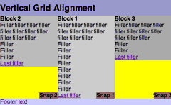
Example of the Vertical Grid technique (simple version with 2-1-3 ordering)
A Night at the Phantom of the Opera
If you just looked at the previous example in Opera (7 or 8, forget about 6), you might have noticed that things are a little off.
First off, it fails to get the vertical positioning right at all if percentages are used. That's why the "L" Snaps are at the very top of the containing tag and don't start in the middle as they should.
Adding float: left and an explicit width: 100% almost solves things, but not well enough. Block 1's snap still floats to the top and none of the elements picks up on the height: 50%. It looks like Opera is a hopeless case, and the best that can be achieved if Opera must be catered for is aligning to the absolute top or bottom using pixels or ems.
Opera Crackers
Secondly, the horizontal shifting works sometimes. That is sometimes it doesn't, failing to apply background colours and shifting the element less than it actually requires. I can't figure out the cause of this monkey business at all (it doesn't appear to be the negative margins since it fails even more spectacularly when ordered 1-2-3) which means that there is no simple CSS fix. (And this is the case whether the layout is percentage-, em- or pixel-based.)
Which means...
Duck Tag Soup
We need a markup fix. If we wrap the element we want positioned on the right, that element can be made to be the width of the column and then absolutely positioned on the right within it.
As if it's not bad enough that it's a markup fix (though since it's just an additonal wrapping tag, it's low down the scale of markup atrocities), we now run into the different models that browsers use to calculate the width of nested absolutely-positioned elements. To be blunt, Opera and IE Win make it easy, but get it wrong (according to the standards, that is, but that's the only game in town).
So for Opera and IE Win all we need to do is:
.verticalalign
	{
	position: absolute;
	bottom: 0;
	width: 100%;
	}
.verticalalign p
	{
	position: absolute:
	right: 0;
	bottom: 0;
	}
NB. floating the inner element would probably do just as well in most situations
But because, Safari and Mozilla get it right, that would make the element-to-be-aligned 100% of the wrapping element. The correct value for the width in those browsers is the actual width of their parent elements. So now we add:
.verticalalign
	{
	position: absolute;
	bottom: 0;
	width: 100%;
	}
#element_1 .verticalalign
	{
	width: 34%;
	}
#element_2 .verticalalign
	{
	width: 33%;
	}
#element_3 .verticalalign
	{
	width: 33%;
	}
Of course, .verticalalign is now too narrow in Opera and IE! So we plump them back up again with a media query hack for Opera (subject to the same caveats as before), and a star html hack for IE. Hey presto!
/* hack for Opera 7+ */
@media all and (min-width: 0px){
.verticalalign
	{
	width: 100% !important;
	}
}
/* hack for IEs of all persuasions before IE7 */
* html .verticalalign
	{
	width: 100% !important;
	}
Opera - let's start all over again
As of the beta version of Opera 9, the position and dimensions of absolutely positioned and fixed position elements are treated correctly when they are nested inside each other (except for that vertical percentage thing mentioned above). So now the width: 100% gets applied as it should. Which screws things up big time.
As I said on the previous page, there is such a relatively small number of Opera users (who in all likelihood upgrade often and early), that it's probably OK to just leave out the Opera 8 fix.
Mind you, if you do want to figure out how to distinguish Opera 9 from previous versions, I'm really not going to stop you. Well, actually I am. You see, I've already got one. CSS3 attribute selectors to the rescue!
/* hack for Opera 7+ */
@media all and (min-width: 0px){
.verticalalign
        {
        width: 100% !important;
        }
/* But Opera 9 does it right, so CSS3 hax to the max */
div[id^="wrapper"] #block_1 .verticalalign
        {
        width: 34% !important;
        }
div[id^="wrapper"] #block_2 .verticalalign
        {
        width: 33% !important;
        }
div[id^="wrapper"] #block_3 .verticalalign
        {
        width: 33% !important;
        }
}
Example of the Vertical Grid technique (2-1-3 ordering)
Where?
Works fully in
IE Win 7 beta 2, IE Win 6, IE Win 5.5, IE Win 5.01, Operas 7, 8 and 9, Firefox 1.5 and 1.0, Netscape 7 and 8, Safari 1.03 (and up)
Doesn't work fully in
IE Mac 5
Pretty much works - but absolute positioning is flaky at the best of times in this tired old workhorse
Netscape 6, Operas 5 and 6
Do not understand the method at all. It is left as an exercise to the reader to figure out the necessary hacks to cope with those browsers if required.
When?
It's a bit finickity, but the technique is pretty sturdy unless you must support older browsers.
You could instead reach for display:table but that results in, frankly, equivalent but less readable code than tables. And you can't then position elements absolutely within the table cells[note]. And even if the positioning was possible, you'd be stuck with the intial source ordering of the columns...
Of course, it should all be so much easier than this, as Eric Meyer laments in CSS Gridlock.
Quest's End
The individual pieces are in place - time to bring the holy bacon home.
Footnotes
- If you've forgotten what I'm talking about or came to this page directly go back and read Any Order Columns now.
- Positioning elements absolutely in table-cells should work in theory, since
position:relativeapplies to any element. CSS 2.1 notes however, that the behaviour is 'undefined for elements withdisplay: table-*'. As Philippe Wittenbergh points out, withtd {position: relative}, it does work... in iCab 3.0 alone.